Attract your customers and make them fall in love with your brand. Make a good first impression and stand out from your competition. One of the first things to do when starting an online business is to create a recognizable LOGO.
Your logo is the one that communicates first with people who are introduced to your brand, so be sure that it is unique and tells the story you want to present. It has a great impact on how your customers perceive your brand.
What logo is a good logo?
- Simple, unique, and distinctive
- Easy to remember
- Easily applicable everywhere
- Looks good in all sizes
- Reflects your brand identity
- Triggers good feelings
How to make a perfect logo? It is not easy, but don’t worry, we are here to make it as easy as possible. Here is what you need before you start with a logo design?
How To Create An Identity For A Brand?
Before you start the logo design, you should create a strong brand identity. Think of your company goals and find the words that clearly describe your brand. Understand your brand personality. When you get a clear idea of what makes it unique and what is it all about, it will be much easier for the next step to present all that with a simple design.
Ask questions about your company: Who are you? What is your business about? What are the words that best describe your goals and visions? How do you want to present your company to the world? How do you want people to remember you? What emotions do you want to trigger?
Analyze Your Competition
See how other people present their brands. What colors do they use? Do they use their full name or just present their brand with a simple picture? Is their logo modern or retro? Is their logo minimalistic or too complicated to discern what the brand is about? Analyze also other brands and their logos that are not in your niche that you like a lot. You never know where you can find inspiration for your own logo.
Discuss your brand with people
Talk to the people around you about how they see your brand. These can be your friends, family, coworkers, and of course, your future customers. It is very likely that they see your brand not in the way you see it. This new perspective can help you reconsider the way you want to present your business. This is the most effective technique to stop thinking like most business owners. Thinking out of the box is very important when you want to differ from other businesses.
Think of the design you like
Do you like a modern, minimalist style, funny or does a retro design work better for your company? Do you have a mascot, some recognizable symbol of your business or do you prefer some abstract marks and geometrical forms? Do you prefer your logo to be a picture with a text or just a picture or just a text?
Pick the Typography
Find a font that will make your logo complete. The right font can tell a lot about your business. There are four basic types of fonts to use. You can combine no more than two fonts that can give your logo a unique look. It can look really powerful if you choose the right typography when you combine different fonts with each other.


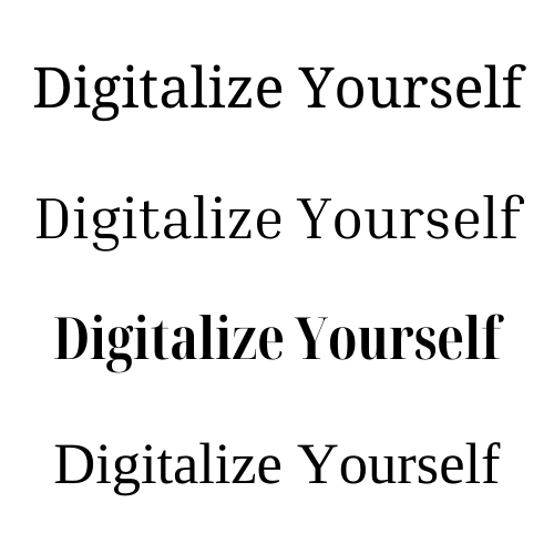
Serif fonts can make your logo look classic and can combine very well with any kind of design, especially with vintage, classic or elegant designs.

Sans-serif fonts are perfect for a clean and modern look. It is easier to read, especially on screens and mobile phones.

Script fonts look like handwriting. There is a huge variety of them, from elegant calligraphic to more simple scripts. They are good for an individualistic look of your logo. It is much better to use this font for just one part of a text because the

Display fonts are decorative and very eye-catching. They can express your uniqueness and creativity in the best possible way
How To Use The Psychology Of Colors In Branding?
Colors can have a great impact on your brand. It is very important to choose the right ones because they say more than you think. Each color has a different influence on emotions and our perception. It can trigger particular behavior of customers. In different cultures, colors have different symbolic. But there is some universal psychology of colors you should know before you pick the right one.
Keep in mind to use two, eventually three colors for your brand. More colors can confuse people sometimes. But there are some big brands like Google and Microsoft with multicolored logos that are very recognizable. Multiple colors of logos symbolize creativity, diversity, and variety. So if you have such a business, a colorful logo can be a great solution.
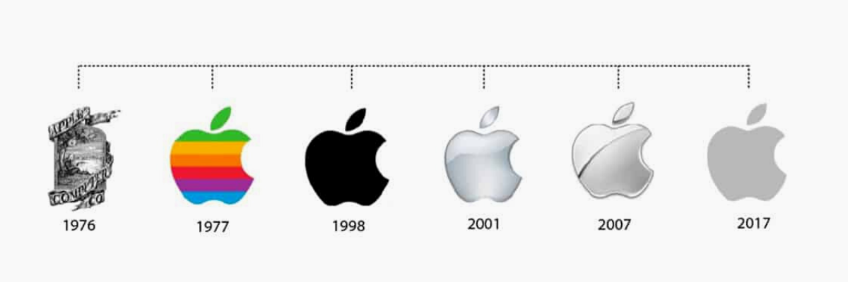
But there are many brands that tend to simplify their logos these years, like Apple. If we track brand design evolution, over time, many brands simplified their design: removed some elements, reduced colors, and increased white space. Everything that was considered complex, they saw it as a surplus and eliminated it.
Let’s see what each color represents and what kind of impact it has on customers. Read thoroughly and make a decision about the color of your logo.
Red Color Psychology
Red is the color of excitement, energy, danger, strength but also of passion, love, and desire. Red attracts attention more than any color, so if you want to stand out from the crowd, this color is a great option. It is a very bold decision and a second popular choice, usually used in the food and retail industry.
Yellow Color Psychology
Yellow represents joy and happiness, intellect and energy. It is proven that it enhances the mental activity and increases the level of energy.
Yellow makes you look friendly and open-minded. It grabs attention – just think of a yellow cab.
Orange Color Psychology
Orange is a combination of red and yellow, so it is a mixture of energy and happiness. It is associated with joy and sunshine and represents creativity, success, and enthusiasm. It is mostly used in the fitness, logistics, and tech industry.
Pink Color Psychology
Pink is not often used for a logo color, but it stands for nurturing, warmth and softness. It is usually used in the beauty and toys industry because it stands for tenderness, youth, and vulnerability. It is a calm and non-threatening color, linked to innocence and optimism.
Blue Color Psychology
Blue is one of the most used colors for logos. It is linked to competence, intelligence, trust, efficiency and this is something that every company wants to be related to. It is an inoffensive color, sophisticated, so if you cannot decide which color to choose, blue is the safest choice.
Green Color Psychology
Green is considered the key color that is connected to nature, purity, health, and freshness. It is gentle, relaxing, and invigorating. It is thought to be one of the most beneficial colors to the mind and body because it produces a calming effect. Green is associated with brands that encourage growth and productivity and is used in the food, health, and fitness industries.
Black Color Psychology
Black is one of the most complicated colors in its meaning and it has various interpretations and both positive and negative associations. Depending on which perspective you look at the black color, it can be elegant, mysterious, or even depressing. It is identified with glamour, sophistication, dignity, and power, but also with death and evil. In the world of fashion, black is always in style. It is timeless, classic, and sophisticated, and that is why many fashion brands have their logos in black color. Black has no shades or tint, it is always solid and is linked to strength and boldness, that’s the reason many sports brands use it for their logo.
Purple Color Psychology
Purple is a beautiful mixture of red and blue, so it is a combination of energy and stability. It is related to luxury and power, nobility and ambition. If you want your brand to be associated with creativity, wisdom, dignity, and independence, purple will be a great choice for you.
White Color Psychology
White is a universal color of purity, innocence, and wholeness. It is identified with perfection, new beginnings, elegance, and serenity. White symbolizes perfection, safety and cleanness, and peace. It is usually used in wellness, tech, and healthcare industries.
Brown Color Psychology
Brown is associated with wisdom, seriousness, and stability. It gives a sense of strength and reliability. Brown is connected to life and growth as it is a color of earth. It is mostly worn by people who impose respect and appreciation through their status.
Where can you put your logo?
There are various places where you can put your logo in order to present your work and express your identity. Some of the most used places are:
- Website or blog
- Business cards
- Signs and banners
- Products and packaging
- Letters and emails
- Invoices and forms
- Social media profiles
- Brochures
- Email messages
- Company apparel
- Business vehicles
- Mugs, cups, and glasses
- Umbrellas
- Bags and accessories
Types of Logo
What type of logo to choose? You have probably seen by now that there are some logos with text only, some others are a combination of typography and a picture. Each logo makes a different feel. So, how to decide which one is the best choice for you?
Monogram Logos or Lettermarks
A Lettermark logo is typography-based and usually consists of a few letters, a company’s initials, like HBO, CNN, H&M… it is a great solution for companies with long names and can look very effective(just think of NASA – the National Aeronautics and Space Administration). But there can be a problem expressing what your business is about. If you are just starting the business, maybe it would be a good idea to add your full business name below, so people can learn what your brand is about.
Because of the focus on the letters, typography is more than important here. Now when you know what types of fonts exist and what they represent, it can be easier for you to decide which one/ones to choose.

Wordmarks or Logotypes
Wordmarks are very similar to Logotypes. They are font-based that focus just on a business name. It can look perfect when you have a short and distinct name. One of the most familiar examples is Google’s logo. Be sure to make or pick a logo that is distinctive and captures the essence of your business.

Pictorial Marks or Logo Symbols
A Pictorial Mark, sometimes also called a brand mark is an iconographic image that is easily recognizable. As an image that simply represents your brand, it is very important that you pick a symbol that is recognizable and unique. Just think of an Apple logo or a Tweeter bird, and you will immediately connect the picture with the brand. But, because it is just an image, it can be very hard to present a business that doesn’t have a strong brand identity without using text.
Abstract Logo Marks
An Abstract logo is just a symbol, designed especially for you. It is usually an image that doesn’t look like anything you have already seen in real life. It is unique and designed to show something specific about your company. This is a fantastic idea when you want to stand out from your competition with something completely new and recognizable.
Mascots
Give your brand a personality. Mascots are illustrated characters that symbolize the philosophy of your brand. The mascot is like a spokesperson to your brand and is usually cartoonish and funny. Look at them as ambassadors of your brand. Just think of the KFC mascot that represents tradition and experience as proof of high-quality food.
Combination Mark
A Combination Mark is a composition of a wordmark or lettermark and a pictorial mark, abstract mark, or mascot. There are various combinations of position of the text and picture: the one below the other, the one next to the other, or the text integrated into the picture. This is the best solution if your are starting out, so everybody can know what your brand is about. Combining symbols with text can help you create a distinct image, easily recognizable
Emblem Logo
The emblem logo usually looks like a seal or a crest. It is usually a combination of a text and a symbol. It has a traditional look and was used through history from family crests to royal stamps. They are memorable and look professional, so they can be a good choice if your company has a long tradition, like Harvard or a BMW. But pay attention that because of many details, this kind of logo will not be visible enough in small sizes.
What are common logo design mistakes?
- Not doing enough research. This is a typical mistake. In that way, you can repeat someone else’s mistakes, or make a logo too similar to your competitors.
- Letting the designer decide instead of you. You are someone who knows the best your business and you know what message you want to send to your customers.
- Having a generic logo. If you are a dentist, you don’t have to have a tooth on your logo like everybody else. Be more creative and distinctive.
- Choosing the wrong color. Your logo has to look good both on white paper or black background. Think there you are going to put your logo and what color to use to be visible.
- Having too many details. Keep your logo as simple as possible. It can be more recognizable and it will look good and clear in all sizes.
- Saving money by making a low-quality logo. Don’t hire a bad designer because you don’t want to spend so much money. That can cost you a lot – people will look at your brand as a low-quality brand. A logo is a great way to show the value of your products or service.
How To Make Your Own Logo?
There are many logo generators and tools that can help you create your own logo without hiring a graphic designer. With some of them, you just need to select the type of logo you want, colors, and fonts, and the tool will generate a logo according to your wishes. Some of the tools are free, and some of them ask you to pay before you download your logo.
Canva
Canva is one of the most popular design tools recently. It is so easy to design anything you need, from posts and stories on social networks, to logos, business cards, flyers, etc. it has thousands of ready templates you just have to modify according to your needs.
When you want to make a logo yourself, just go to the LOGO section, choose a template that you like the most, and start editing. You can change each element you see: shapes, colors, font, etc. You can also add a new element or delete an element you don’t need. You can download it in the wished format, so you can use your logo for any purpose.
You can use Canva both on your computer or as an app on your mobile phone. You don’t need any tutorial to see how to use the tool. It is very simple and logical.

